William Playfair had quite the life and came from quite the family. He was one of four brothers; John helped create the discipline of Geology with Hutton, wrote the definitive biography of Euler, and cofounded the Royal Society of Edinburgh; James was a fine architect whose son William designed much of Edinburgh’s New Town and the National Gallery. The fourth brother didn’t do much of anything and he is my many greats grandfather*
So back to the pie chart. It is hard to imagine things we so take for granted, were indeed invented. William was an astonishing, pioneering, creative man; as well as the pie chart, he single-handedly came up with 90% of what is used today in statistical graphics. He published the first examples of the top five excel chart options; the line, bar, column, area, and pie chart. All “Oor Wullie”.
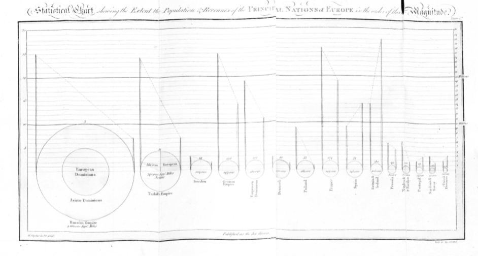
So how did he come up with them? What prompted this astonishing burst of creativity in the late 1700’s? William’s relentless pursuit of new ways to show dull old data are well documented. Line and bar charts both have antecedents, and their origins are well documented. But the pie chart? It came out of nowhere and has long baffled historians of statistical graphics. There are no clear proto-pie charts. Euler had created his diagrams, but the idea of a circle representing a value and carving it up into slices was entirely novel. This week I found myself in the British Library holding, inspecting, touching a first edition of William’s Statistical Breviary. This small book contains the fold out data visualisation within which we find the first pie-chart. I took the scan below. I now think I know how and why and how he came up with the pie-chart.
One thing you don’t get from the scan, the chart is tiny. The book is no more than a notebook, you could fit it into a large coat pocket. The pie chart is no bigger than the top joint of my pinkie, my photograph of the British Library example is below.
In this multi-variate graphic William has re-used his idea of the proportional symbol; circles are scaled to land area. The proportional symbol devise was yet another of William’s inventions debuted in the Breviary. His work directly inspired Minard to create his famous thematic maps. Incidentally elsewhere in the Breviary he also invents the Venn diagram 80 years before John Venn re-invents them!
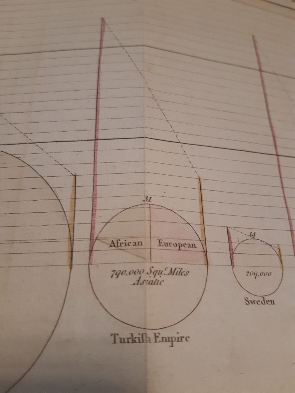
Now William has another stroke of genius. He decides to shade the symbol by whether the nation is a maritime or a land power. Britain’s bubble is shaded red and France’s green. But he hits a problem, some empires are both maritime and land powers. What to do? In the first and largest bubble, Russia, he chooses to show the symbol as two concentric bubbles. Europe’s red maritime bubble sits inside the larger green Asiatic bubble. He then needs to figure out how to handle the Turkish empire. He has two critical problems here. To follow his convention of splitting his bubbles by continent he would need three concentric bubbles (Asia, Europe, and Africa). And critically he has run out of paper real estate. The graphic is tiny remember.
He can’t use the devise he used for Russia. It’s impossible to create three bubbles and fit his beautifully placed labels into that half inch he has for the Turkish empire. Africa would be too thin, and the none of his labels would fit within the arc of each bubble. I can almost feel him looking at the data and scratching his head. I speculate he plays around freehand on paper, bubbles in bubbles, maybe use squares, or use call out labels, or have separate bubbles, or sacrifice his labelling convention. Then… bam. If I carve up my cake radially instead of concentrically…. His two problems are solved. He has enough room to place his labels, cover three or more categories, and still show relative sizes. The pie-chart is born. As to why Africa is yellow, well it’s neither a land or maritime power. He has red and green watercolour kicking around, so sod it he thinks, I’ll just mix the green and red paint.
What can we modern data scientists and data-visualisation professionals learn from this? This innovation arose from a very practical problem William had to solve. It was not brain-stormed, did not arise from user feedback, and came from the imagination of one man. The lack of display real estate is an all too familiar problem those of us designing for the mobile phone face; and labelling is a notorious minefield for graphics and maps. Faced with these two-age old problems, and under a print-run deadline, he invents. And that is how innovation happens in the real world.
*I cannot claim definitive proof of this. It is family folklore involving illegitimacy, a kitchen maid and a husband a long way away in India.